ProDataStack is a data intelligence platform designed to transform how value is understood and negotiated across the sports ecosystem. By combining performance analytics, influence metrics, and commercial benchmarks, the platform gives athletes, agents, clubs, and governing bodies the clarity they need to make smarter decisions.
As the platform evolved, the existing brand no longer reflected the ambition of the company. What began as a technical analytics tool had become something far more powerful: a strategic intelligence system for modern sport.
The challenge was to design a brand that could express both authority and disruption – balancing analytical rigour with the confidence to challenge industry conventions.
Together, we combined innovation with intelligence, challenging outdated systems and processes with smarter, sharper alternatives.
Sport remains an industry driven by tradition. Negotiations are often shaped by reputation, perception, and fragmented information rather than clear, structured intelligence.
ProDataStack exists to change this dynamic. The brand needed to communicate three fundamental qualities:
These qualities formed the foundation of three guiding archetypes:
The resulting brand sits at the intersection of data, strategy, and disruption.
The identity was designed as a flexible system, capable of scaling across multiple touchpoints within the sports ecosystem.
For athletes and agents, presentation materials were designed with a stronger sense of energy and confidence.
These materials highlight performance benchmarks, influence metrics, and valuation insights in a clear, compelling format, showing how agents and athletes can be enabled to approach negotiations with data-backed leverage.
For clubs, leagues, and governing bodies, ProDataStack produces structured reports that translate raw data into clear strategic recommendations.
The design system ensures these documents feel authoritative and consistent with the wider brand, reinforcing the platform’s role as a trusted intelligence partner.
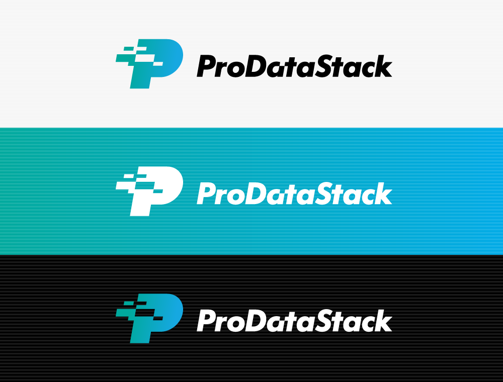
The visual identity was designed to express precision, structure, and forward momentum.
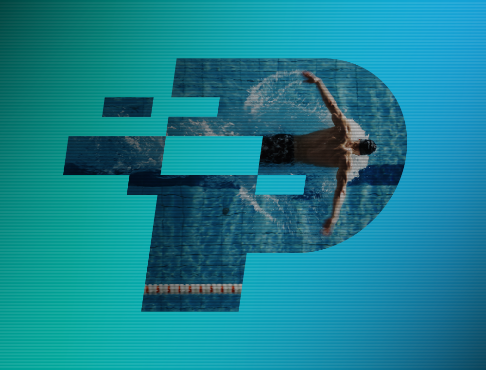
The logo draws inspiration from layered data systems and data transfer, using energetic graphics to represent the stacking, integration and transfer of intelligence.The graphic elements reflect layers within the platform – performance data, influence metrics, commercial insights – combining into a single cohesive system.
The typeface for the logo was chosen for its geometric boldness and legibility. To give brand ownership the characters were subtly adjusted to differentiate from the standard typeface – the logotype element was skewed at exactly the same angle as the ‘P’ symbol, and one section of the first ‘a’ was removed so that it could connect to the ‘t’ and therefore reinforce the data transfer theme from the ‘P’ symbol.
The result is a mark that communicates both analytical clarity and strategic movement.
The wider identity system extends this idea through modular layouts and data-inspired graphic elements, creating a visual language that feels technical, confident and dynamic.
The brand balances discipline with disruption, reflecting the analytical foundations of the platform while signalling its role as a challenger within the sports industry.
Typography plays a central role in establishing the authority of the brand.
A modern, structured type system was chosen to reflect the analytical nature of the platform while maintaining clarity across product interfaces, reports, and presentations. A range of complementary typefaces were chosen to allow for any situation, from strong, call out messages to dense data and graphs.
The type system is based around three typefaces, each chosen for specific use in mind. The headline typeface reflects the logotype and delivers a message with confidence and impact, teamed with the italicised highlight box the viewer knows exactly where to start reading. The bodycopy typeface is slightly condensed which allows for maximum legibility within a grid system with narrow column widths. A third condensed typeface was chosen for impact as subheadings, this typeface was also used within graphs and charts where space is at a premium.
The typography balances precision with readability, allowing complex insights to be communicated clearly across both digital and print environments.
The colour palette was designed to signal intelligence and confidence.
Deep base tones reinforce credibility and trust, while brighter accents introduce moments of energy and innovation. These accents also function as visual indicators within product interfaces, highlighting key data points and insights.
The result is a colour system that supports both brand storytelling and product usability.
Finding the right images was just the beginning of the process. Each image underwent a complex treatment to bring out the dynamism of a still photograph. This treatment allowed us to put the ProDataStack brand stamp on each visual element of the rebrand, and help bring together a solid brand cohesion.
Each chosen image went through an eight to ten step process to build up the data transfer effect. A decision was made to only use this image effect in instances where information on the page was minimal. Where a lot of information was displayed, a more simplistic background image style was developed so legibility was not affected. This also gave documents more visual variation.
The identity was designed as a flexible system, capable of scaling across multiple touchpoints within the sports ecosystem.
Athlete and Agent Sales Decks
For athletes and agents, presentation materials were designed with a stronger sense of energy and confidence.
These materials highlight performance benchmarks, influence metrics, and valuation insights in a clear, compelling format, showing how agents and athletes can be enabled to approach negotiations with data-backed leverage.
Reports and Insights
For clubs, leagues, and governing bodies, ProDataStack produces structured reports that translate raw data into clear strategic recommendations.
The design system ensures these documents feel authoritative and consistent with the wider brand, reinforcing the platform’s role as a trusted intelligence partner.
The ProDataStack rebrand positions the company as a new category of sports intelligence platform.
By combining strategic messaging with a dynamic design system, the brand now communicates both authority and disruption – reinforcing ProDataStack’s mission to challenge outdated processes across the sports industry.
The result is a visual brand that reflects the platform’s core philosophy that talent creates opportunity, data secures it.
